
In November, Google announced mobile-first indexing and that it would be prioritising mobile search results over desktop search results. In the same month, mobile internet usage overtook desktop for the first time. And whilst you may have sat back and thought, “Well I knew that was coming”, and felt satisfied that your website was responsive, we ask: is responsive enough?
In fact, yes – a responsive website is still the recommended approach, but a problem arises if the responsive website is derived from a desktop design. Most websites that are a few years old will be – which made perfect sense at the time – but a few years down the line in 2017, mobile is king of the internet and it is the desktop that’s become the secondary device.

Here are four reasons why a responsive website created from a desktop idea is no longer enough:
1 – Content
If your responsive website is derived from a desktop design, it’s likely that the content has been created for desktop too. With Google now prioritising mobile over desktop you could be in danger of dropping your search ranking position if your content has not been optimised for mobile.
2 – Site usage differs depending on device
Consider the user experience and what you want your website visitors to do on your site. How you treat your call-to-actions, and what those call-to-actions should be, differ on mobile and desktop for true optimisation.
For example, people still prefer to buy on a desktop and complete long forms on a desktop. However, download requests, watching a video, creating an account or even adding an item to the basket for later (with a follow-up email to purchase) work better on mobile. Whilst you may not be pushing for an immediate sale, you are giving interested mobile visitors the opportunity to engage with you and continue the purchase when they are ready.
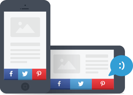
3 – Get sharing
You are more likely to get social shares via mobile than desktop. Therefore, you may wish to prioritise social share buttons on your mobile sites over desktop sites so you are organically getting your content to more potential customers.
4 – Site speed
Page speed has always been important, but with mobile-first indexing it’s critical. In fact, the frequently used stat is that mobile users will leave your website if it takes longer than three seconds to load*. If a visitor comes to your page and leaves within a few seconds, it’s an indication to Google that the site is poor and they didn’t quite find what they were looking for, which then impacts your search ranking and is a potential lost customer!
And with Accelerated Mobile Pages (AMP) it certainly doesn’t have to be that way. AMP is an open source project from Google and Twitter designed to create mobile optimised content that loads instantly almost everywhere. Websites using AMP have reported increased traffic, more time spent on the site, more clicks and even more sales!
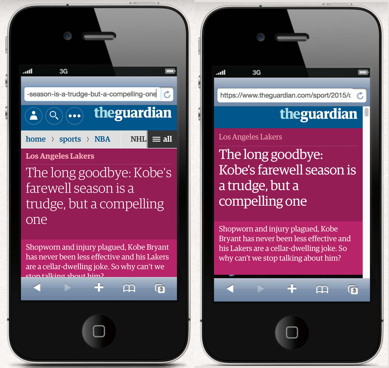
*The Guardian’s normal webpage on the left. Google AMP version on the right.
If you have any questions about mobile-first indexing or would like us to carry out an audit of your website please email hello@onebite.co.uk or call 01635 887 707.